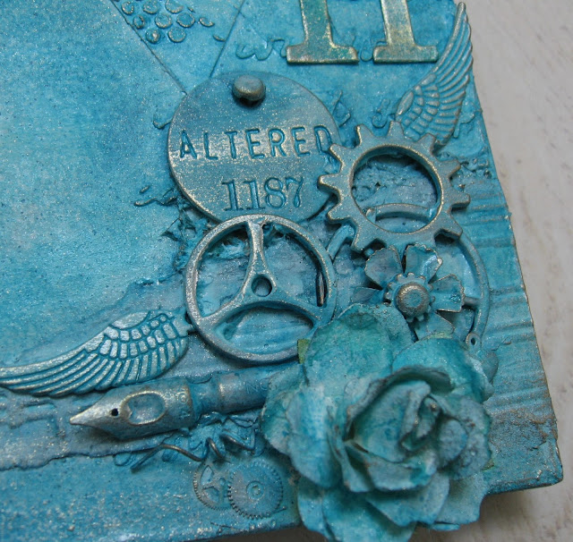
So I thought I would show you my very un me..wish it was a different colour make:
I think it is just too bright!, that said i love the textures ...so maybe this needs a good coat of gesso!
I am still in love with the idea of collecting all these pieces to create textures and layers...including scraps of embossed cardstock, old watch parts, paper flowers and lots of yummy ideo-ology....
I still love the whole texture paste and stencil thing...
.and hearts of course...
I just wish I hadn't made it quite so bright blue!!...
So let me know what you think!? A busy day .... but James seems to be getting slightly stronger...fingers crossed...that makes any day feel better!! He is still on mornings but may try and stay for lunch today!!...baby steps x
have a fun and inky one!
trace x


I do all my canvasses in blue/turquoise just like this! I LOVE what you have done here, I went to the brown one and liked that too, but this one makes my heart sing! What paint did you use to stick to the metal like that, I can't see a layer of gesso under there as the metal is still shining through...
ReplyDeleteHi Trace.........I love this tag and all the beautiful textures and layers. i really like the colour but I understand what you mean as I find it hard to go out of my colour comfort zone too.
ReplyDeleteHave a great weekend
Annie xx
Wow, I think it is the right color for this canvas. Soooo gorgeous, Trace.
ReplyDeleteHave a wonderful weekend
it´s fab as it is Trace! I always adore your choice of colours!
ReplyDeletethey are always amazing and congenial every time!
great tag Trace!
xxx
Susi
It looks very you Trace apart from the colour and I just love that colour--maybe you need to add a bit of wire somewhere lol
ReplyDeleteHave a good day
Love Chrissie xx
It is so hard to be completely honest...but I think it would look great if you toned it down a bit with the gesso or ???
ReplyDeleteI love everything about it but it is too bright for me too. It is my favourite colour but I like it just a titch lighter in tone.
I was thinking that maybe if you only toned down part of it and left some of that lovely blue intensity here and there, then it may be just the ticket
I love all the texture & layers & embellishments, but it is very blue. :) And that is NOT a criticism, it's just that I'm not a blue person either. I do like the blue Dylusions but I have to add other colours to them. Live with it for a while, then see how you feel.
ReplyDeleteI love it, a refreshing change i think. there's very little about your art that i don't admire, but I absolutely love it when the obvious grunge colours aren't in use. ghats the thing about differences, huh..I'm definitely drawn to the brights!.
ReplyDeleteI love it as it is, but then I like bright colours!!
ReplyDeleteGlad to hear that James is improving, hope he is fully better soon.
Trace the colour certainly is different, but the style is still totally you I think, with all your wonderful feel for texture, composition and design, and to be honest, I think it is stunning with so many beautiful little details to admire! So glad to hear James is making progress!
ReplyDeleteWow i love this, gorgeous color and i love the texture on it! Groetjes karin
ReplyDeleteSo glad to hear things are improving for James.
ReplyDeleteLove the texture on this - could you add a misting of other colours or maybe dry-brush with a different shade (lighter or darker)? Look forward to seeing what you do to it. Hugs, Jenny x
Looks like it's made by you - it's still your style and the colour looks good to me!
ReplyDeleteI like it the way it is Tracy, so many nice details...but you could bring on some brown, green or grey paint/ink to make it more you?
ReplyDeleteAnyway...I like it!! :-)
kind regards, Alie :-)
It's very blue, but I like it. I love how you have put all this together I think it looks fab
ReplyDeleteLove
Amanda x
Sorry, blue is my most fav colour... So I do like this, but then that is more because under the blue the embelli and design are great! Hugs, Gerrina
ReplyDeleteI think its gorgeous Trace - I do think it would look even better in neutrals though - but I still love it xx
ReplyDeleteI love the blue Trace and the texture is fantastic. I always love hearts so this really appeals to me. The stencil on my tag , I am presuming you mean the lettering one that looks like and eye test chart is by Crafters Workshop and I got mine from The Stamp Attic. Tracy x x
ReplyDeleteHi Trace
ReplyDeleteI have to say that I love this wall hanging I know what you are saying about the colour not being you but if I saw this somewhere I would think that it was you that made it.
I love the style, the texture, the layers and the way you pull everything together which makes for a fantastic project.
Love it
Ria
This is stunning Trace! Not sure why you think it's too bright, looks perfect to me! A fab' example of what your creative mind can do, a great piece. Chris xxx
ReplyDeletePS Glad James is improving. xxx
Well I think it is really beautiful, I do see why you say it isn't you, not your color for sure. A whitewash will make you happy, still a great piece.
ReplyDeleteHugs Eliza
Oh and I came here looking for your aster flower and found this beauty.
Hi Trace, I think it is absolutely stunning - all those wonderful elements - love the heart, the embossing, the colour - everything really! But I guess I do like blue, the brighter the better ....... I think it is great that you are doing things outside your comfort zone, it just shows how versatile you are.
ReplyDeleteGood to hear an update on James, hope he keeps continuing to improve (for James'sake and yours). Take care and have a lovely weekend. Hugs, Anne x
Love this Trace, such fabulous elements to create texture. The blue is gorgeous, how about a bit of dry brushing in white to highlight some areas? Hope James continues to feel better and gets stronger. Lots of prayers and positive thoughts still coming your way.
ReplyDeletehugs {Brenda} x0x
It was covered in gesso, Dylusions and homemade distress spray then I added treasure gold overthe top to give the metal effect . Trace x
ReplyDeleteHi Trace, it is BEAUTIFUL and very recognisable as yours! I love all its elements. I don't feel I am 'in your league' at all to make suggestions - I think its wonderful as is.
ReplyDeleteHope James continues to do well. Have a lovely weekend. Nicola x
Thats stunning. fabulous colour and texture
ReplyDeletehugs June xxxx
A fabulous tag, the blue looks great :) But you're right it's a bit un-you ;)
ReplyDeleteHi Trace, I hope James keeps feeling better and doing well! I have worked on a couple of these now with different colors and find that just a little highlighting with gesso makes me happy! Since you mentioned a layer of gesso, just dry brush it on in a few areas and see what you think! I love this as is. The color and all the elements are fabulous! Hugs!
ReplyDeleteFabulous work Trace, I love the colour...it's Gorgeous!!so many wonderful textures & I love the design... Brilliant work!! Hugs May x x x
ReplyDeleteAs one who loves colour, I think this is wonderful. You can still see all the gorgeous layers and texture and the treasure gold is a perfect final touch. Do what makes you happy but if sometimes it makes you question yourself then that's good too - that's why you keep growing and making amazing art.
ReplyDeleteSo good to hear about James - baby steps always make sense!
Have a wonderful weekend and we'll catch up soon.
Hugs, Juliaxx
I certainly wouldn't gesso it yet... it's fab! Give it a few days and see whether it grows on you... I love how the metal holds its own in all that colour, and the finish on the lettering is gorgeous... Having said that, I'm having almost the exact same problem with a canvas at the moment - I've done so many layers on it that it's getting heavier!
ReplyDeleteAlison xx
Love the design work and the texture - I did go back to look at the rusty tag and yes Trace I do see a huge difference. Some people like some things while others like other things. Did you go back and redo this tag - if so can you show us the before and after pictues.
ReplyDeleteThanks for sharing your updates about James. There are a lot of your fans in Blogland that keep you and your entire family in (my) their prayers.
Sandy
I love blue and all of the layering of your elements. Maybe add highlights in a much lighter color or a darker color for more depth.
ReplyDeleteBlue happens to be my favourite colour, so loving this.
ReplyDeleteMandy